|
By: Paul S Cilwa |
Posted: 1/7/2026 |
|
Page Views: 22 |
| Hashtags: #Namtira #VisualBasic #VBNET #ClassLibrary #NamtiraLib #Fonts #Typography #MovableType #BiSheng #Blackletter #RenaissanceType #Italics #BoldType #Underlining #Serif #SansSerif #TypeDesign #PrintingHistory |
| A historical exploration of how fonts evolved from handwritten scripts to movable type and modern digital typography, tracing calligraphic origins, East Asian printing innovations, Renaissance italics, and the development of bold and underline as tools of emphasis. |
| Estimated reading time: 4 minute(s) (941 words) |
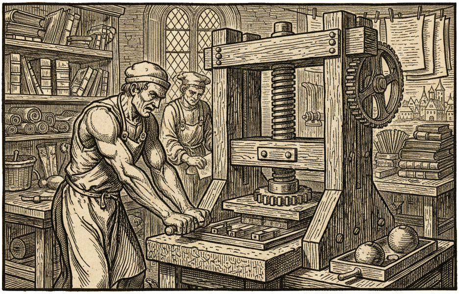
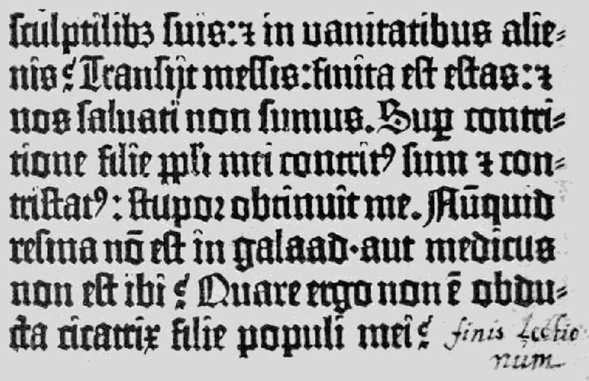
Long before Gutenberg's press, East Asia had developed robust printing traditions that approached
the same problems from different angles. Woodblock printing in China, Korea, and Japan had produced
books and images for centuries; experiments with movable type began early—Bi Sheng is
credited with ceramic movable type in China in the 11th century, and Korea developed metal movable
type that produced works such as the Jikji in the 14th century—showing that the technical
idea of discrete, reusable characters existed long before European metal type and that different
writing systems shaped different solutions. The thousands of logographic characters in East Asian
scripts made casting and sorting far more complex than alphabetic systems, which is why woodblocks
and hybrid methods remained common even where movable type existed.

Across cultures, calligraphy supplied the visual grammar that type designers translated into
durable forms. In China the evolution from seal and clerical scripts toward the regular script
(kaishu) established proportions and stroke conventions that later printers and typefounders
adapted for legibility in print; in Europe, humanist and chancery hands of the Renaissance directly
inspired the Roman and italic types that became the basis for modern serif and slanted designs. The
technical constraints of materials and tools—wood carving, clay or metal casting, punch
cutting, and press mechanics—forced simplification and standardization: consistent baseline,
x?height, stroke contrast, and spacing became practical necessities that later became aesthetic
categories (serif vs. sans, roman vs. italic, text vs. display).
Standardization accelerated as printing became industrial: the division of labor produced
specialist punch cutters, casters, and typefounders who refined families of sizes and styles so
printers could mix and match weights and sizes reliably. Those centuries of craft practice left a
vocabulary—glyph, sort, matrix, typeface, family, weight, baseline—that maps directly
onto digital typography. When fonts moved into software, designers carried forward the same goals
(legibility, consistency, cultural resonance) while adding new constraints and possibilities:
scalable outlines, hinting for low?resolution displays, and encoding systems to handle many
scripts.
Italics began as a deliberate imitation of slanted, cursive handwriting and were first popularized
in the early 1500s by Venetian printer Aldus Manutius using a type cut by Francesco Griffo; bold
and underlining emerged later as pragmatic, typographic ways to add emphasis when italics alone
were insufficient.
The italic style grew directly from the cursiva humanistica—a fast, slanted hand used by
Renaissance scholars—and was intentionally translated into type to evoke the look and economy
of handwriting in small, portable books. Aldus Manutius commissioned Francesco Griffo to cut a
condensed, sloping face around 1501, producing compact pages that mirrored contemporary manuscript
cursive and made classical texts more portable; this Aldine
italic was widely copied and
became the model for typographic italics, while later designers such as Ludovico Arrighi refined
the form into a more modular, elegant italic better suited to printing and reading in continuous
text. Because italics were born from calligraphic gesture, their visual language—slant,
stroke modulation, and occasional ligatures—carries connotations of citation, foreign words,
titles, and a voice distinct from upright roman text; over time printers and readers adopted
italics as the primary in?line method for emphasis and differentiation.
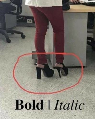
Bold and underlining followed different paths as solutions to the same editorial problem: how to
make certain words or passages stand out on the page. Bold type is essentially a weight
increase—thicker strokes and darker color on the page—that evolved as foundries and
printers developed heavier cuts for display and advertising in the 18th and 19th centuries;
designers and publishers then repurposed these heavier styles to mark headings, strong emphasis,
and visual hierarchy where italics might be too subtle or illegible at display sizes. Underlining,
by contrast, is an editorial convention that predates mechanical type: scribes and readers used
marks beneath words to flag importance, and with the rise of typewriters and later digital text,
underlining became a simple, device?agnostic way to signal emphasis or links when italic or bold
options were unavailable or inconsistent. Both bold and underline therefore function as contrast
tools—bold by increasing stroke weight and optical density, underline by adding a linear
marker that isolates a word from surrounding text—each chosen according to legibility,
medium, and cultural convention.
In practice, typographers treat these devices as part of a toolkit: italics for nuance and voice,
bold for strong emphasis and hierarchy, and underlines for functional marking or legacy contexts
(for example, links or manuscript cues).
So, in modern-day print terminology, a typeface is the visual design or family of letterforms;
a font is one specific member of that
family defined by weight, style, and historically by size. In traditional printing a font
means the complete set of metal sorts for a given size and style (for example, 10?point Garamond
italic). In digital typography the terms are often used interchangeably in casual speech, but the
technical distinction remains useful: the typeface is the design, the font is the delivery of that
design in a particular style/weight/format.